Chipotle's Ordering Experience is Inaccessible - Here's How to Fix It
Published September 06, 2020
Recently, I was ordering some delivery from Chipotle, and out of curiosity I tried to tab through the menu, only to discover that I couldn’t! Here’s some of the issues that make the Chipotle ordering experience inaccessible, and how you can prevent them in your own project.
A quick note before we start: I wrote this article in September of 2020, and Chipotle may well have fixed these issues by the time you’re reading this - I certainly hope so! This article is a review of the issues with their site at the time I wrote it, and I hope that by publishing some issues I’ve found in an actual production website I can show developers what some common accessibility issues are and how to fix them.
The Homepage - Starting Our Order


Let’s start at the homepage. Let’s say I am a user who is only using a keyboard and I want to order a burrito. Great, it’s on the homepage! Let me just press Tab to get over there:
If you can’t watch the video above, I tried focusing the order button, but after focus moved naturally through several items in the header, it just jumped to a single terms link after the Order button, and then down to the footer! No matter how I try tabbing around the page, I absolutely cannot focus on either the “Order Now” button or a specific food item.
So why might this be? Unless they are using tabindex="-1" (which removes an element from tab order), the only way this could be is if the site wasn’t using semantic HTML. Let’s take a look at the “Order Now” button using the Chrome DevTools:
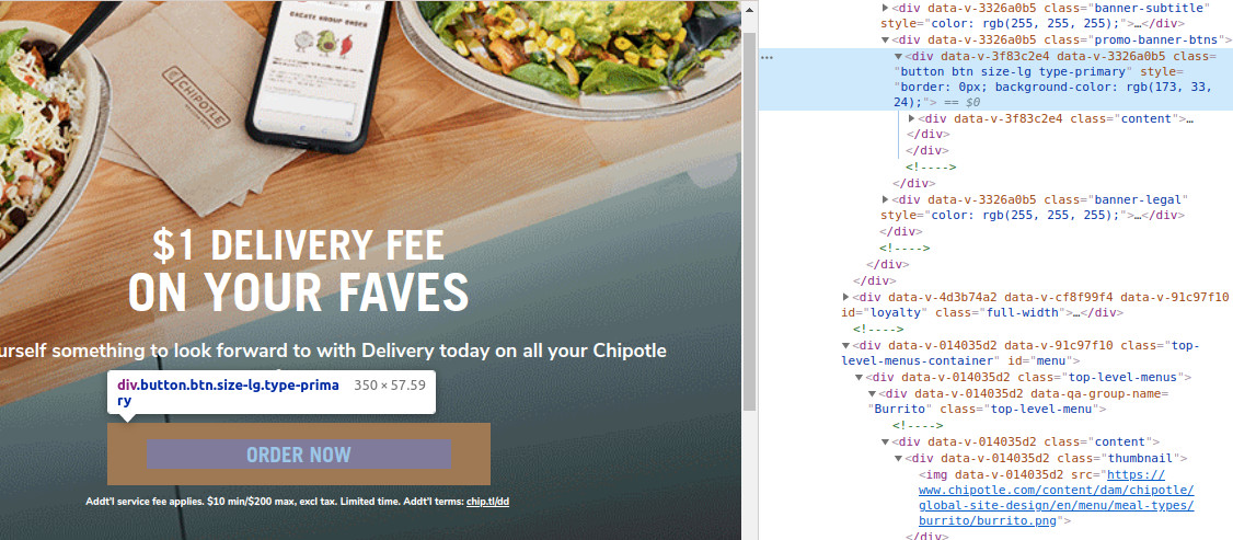
Oh dear, that “Order Now” button is just a <div>! Thanks to the powers of JavaScript, we can make a <div> interactive, but that doesn’t mean we should. There’s a lot of inherent functionality that comes with the HTML <button> element, and one of them is that it’s tabbable by default and clearly interactive to screen readers. Since this is just a <div>, though, we can’t tab to it and a screen reader won’t identify this element as a button!
What about the “Burrito” button, is it the same situation there?
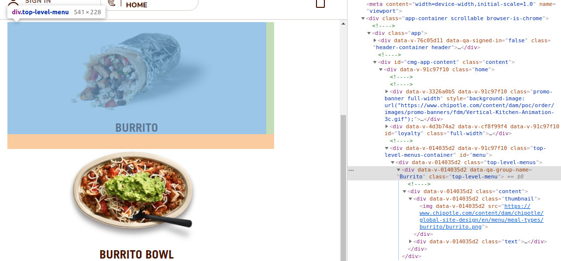
Well sheesh, it looks like it is! Here we’ve got an <img> element wrapped in a <div> that likely has some JavaScript hooked up to make it interactive. Once again, this doesn’t get added to the tab order and isn’t clearly interactive to screen readers, so if you’re not using a mouse, there’s no way for you to even start ordering food from Chipotle! That’s a giant accessibility issue if I’ve ever seen one. 😬
Building Our Burrito
For the purpose of continuing to examine this site, let’s say your friend wanted to help you out and linked you directly to the page to build your burrito. Can we place an order from this point forward?
Well, let’s start by trying to pick our meat by tabbing into the meat options and see what happens:
Oh dear. In the video, I started in the browser’s URL bar, and the only two elements I could focus on were the Chipotle logo and the “Return to Menu” link! Not only could I not focus on any of the protein options, I also couldn’t access the links to sign in or view my cart.
Based on our previous experiences on the homepage, I have a feeling why this might be the case, but let’s inspect the “Chicken” card with Chrome’s DevTools:
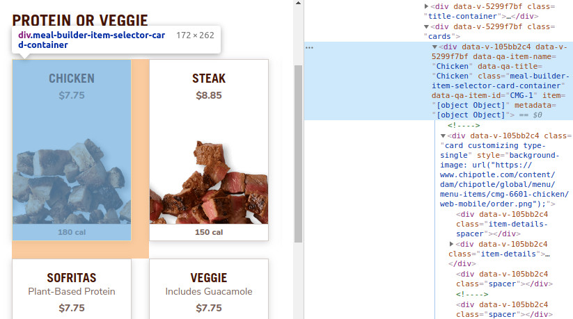
And unfortunately, my gut feeling was right - this clickable “Chicken” card is once again just a series of <div> elements, so it’s not tabbable and not marked as interactive for screen readers!
To be clear, these are not the only issues on this page. There are issues varying from <img> elements not having alt tags to the page not using headings at all to organize the content. The main issue to me, however, is the complete inability for users who cannot or do not use a mouse to interact with the site, as this completely blocks a huge portion of users from using the site!
How Could We Fix These Issues?
Luckily, fixing these issues is pretty straightforward, and comes down to a few simple steps.
- Change interactive elements to be
<button>or<a>elements - Test keyboard interaction to ensure that you have clear focus styles
- Test with a screen reader to ensure that content is clear
For the first step, we want to make sure that any elements the user can click that redirects them (either to a different page or an anchor on the same page) uses a anchor tag (<a>). This is also simpler to do than using JavaScript for navigation!
If the clickable element is not used for navigation and does something on the same page (like adding a burrito to our cart), we should use a <button>, which makes it clear that the element is interactive and does not perform navigation.
Testing keyboard interaction is fairly simple - try unplugging your mouse and make sure you can use your site using only your keyboard! You should be able to use the Tab key to navigate between interactive elements, and use the Enter or Space key to activate buttons. If you can’t reach an interactive element with your keyboard, it’s probably not using the right HTML element.
As for ensuring that the content is clear for screen readers, in this case I would suggest adding an empty alt tag (alt="") to all the images of food and ingredients. An empty alt tag marks images as decorative, which is appropriate here, since there’s already text below the images indicating what the option is. There’s no point saying something like “Photo of a meaty delicious burrito” right before the “Burrito” text!
There are, of course, further accessibility fixes and enhancements we could make to these pages, such as adding headings (so a screen reader user can easily jump to ingredients they care about), fixing modals not trapping focus, and more. These fixes would probably get the site to a point where users just using a keyboard can at least place an order, even if the experience isn’t great.
How Could We Have Prevented This?
Accessibility conversations often focus on remediation - bringing inaccessible sites closer towards accessibility. While this is very important, it’s also important to consider how you can have a process that ensures accessibility from the very beginning. There are a lot of strategies you can employ, but I’d mainly recommend the following:
-
Design with people with disabilities - The best way to avoid inaccessible products is to make sure you have a diverse group of people in the room when you’re designing! If your designers have a disability of some kind, they’ll bring their perspectives and experiences with them in designing a product that’ll work for them.
-
Use inclusive design principles - Microsoft’s Inclusive Design page is a great starting point for this, but designing with inclusion and accessibility in mind can really help make sure your product works for everyone. When you explicitly ask questions like “How do users who use a screen reader interact with our product?”, you can make sure your engineers consider those scenarios and build for them.
-
Test with people with disabilities - There are a wide variety of different disabilities folks have, and one of the best ways to make a product accessible is to actually ask those folks to test your product! This also helps to ensure that your product isn’t just usable, but actually works really well for users with disabilities. After all, accessibility isn’t just a checklist of dos and don’ts - it’s a way of ensuring all people can use our products and have a great experience.
-
Test for accessibility yourself - using automated tools and assistive technology, you can often emulate the experience of a person with disabilities. My article on accessibility testing tools can be a helpful starting point for this.
I hope you enjoyed this article, and that it helps you spot accessibility issues before they get out to your users.