Creating Accessible Forms: The Basics
Published April 05, 2020
Forms are one of the biggest ways users interact with websites, and as part of creating an accessible website, we need to know how to make accessible forms. In this post I’ll show you the fundamentals of how to make a basic form accessible.
A Faulty Form Example


Let’s walk through a pretty common example - a signup form. Here’s an example of a signup form that I see around the web:
Now before we continue, can you poke around in this form and see what’s wrong with it?
What's Wrong With This Form


From manual testing and some automated tools, you might have noticed a few issues with this form. Here are the main ones:
- The inputs aren’t properly labeled, making it unclear what each field is to screen reader users
- The form’s submit button isn’t focusable, because it’s a
<div>. This means keyboard users cannot submit the form - The form has no submit action, so pressing Enter won’t submit the form. This makes the form harder to use for keyboard users, on top of issue 2.
- None of the fields are marked required in the HTML, which makes it harder for screen reader users to hear what fields need to be filled out
Fixing the Faulty Form


Now that we know what some of the form issues are let’s see how we could fix them, issue by issue.
Inputs Aren't Properly Labeled (Text)


First up, the largest issue with this form: the inputs aren’t properly labeled!
Before we get into how we can fix this issue, you might be wondering: how could I have caught this issue? There are two answers to that question.
First, you could use a screen reader to go through the form, which would let you hear that a screen reader can’t tell what the <input> is for. With ChromeVox, I just hear “edit text” for the email input and “radio button unselected” for the plan radio buttons, which is a huge red flag!
Another you could find this issue is using an accessibility checker like HTML_Codesniffer or Google Chrome’s Lighthouse. If you want to learn more about these tools and others like them, check out my previous article on accessibility tools.
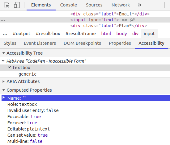
Lastly, a good tool to spot check the accessibility of a specific input element is the Accessibility pane in Chrome DevTools, which you can learn about at Google’s Page on the DevTools Accessibility pane. Here’s a screenshot of what I saw in the Accessibility pane:

Notice how the Accessibility pane shows the name as just “”, which shows that the field is not labelled in any way. So how do we fix it?
First, let’s take a look at the code at relevant code for the email input:
<div class="label">Email*</div>
<input type="text">
The proper way to mark up this input is to use a <label> instead of a <div> for our “Email” text and add a for attribute to the new <label> that will point to the ID of the input, like so:
<label for="email" class="label">Email*</label>
<input id="email" type="text">
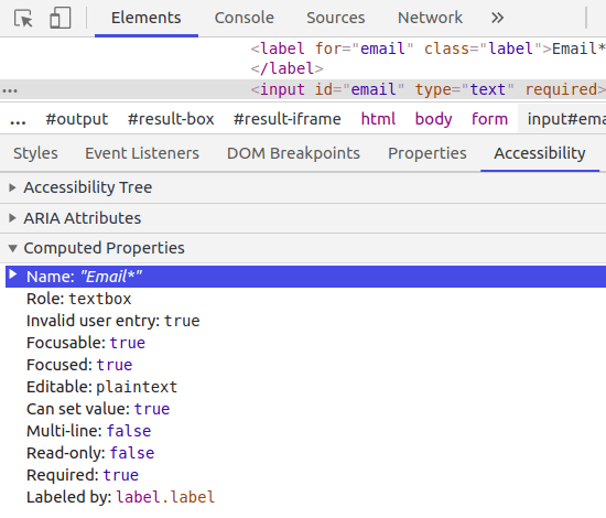
Now if I use a screen reader I properly hear that the input is meant to be an email, and inspecting the element tree with the Accessibility pane shows this as well:

Inputs Aren't Properly Labeled (Radio Buttons)


The previous technique of properly using a <label> with the for attribute mapped to the id of our input field solves part of our problem for radio buttons, but not all of it. Why do I say that?
Even if we properly label our radio button, the label would only be “Free” which does not communicate that this is a selection of plans. To fix this, we can wrap the radio button options in a <fieldset> element and make our “Plan” text a <legend> element, like so:
  <fieldset class="label">
    <legend>Plan*</legend>
    <input id="plan-free" type="radio" name="plan">
    <label for="plan-free">Free</label>

    <input id="plan-pro" type="radio" name="plan">
    <label for="plan-pro">Pro</label>
  </fieldset>
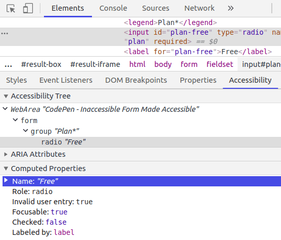
This ensures that screen reader users get informed that the “Free” and “Pro” inputs are related in a group of fields related to picking your plan. Here’s a screenshot of the Accessibility pane with these fixes:

Notice that the Accessibility Tree shows that our “Free” input is in a “Plan” group, confirming that we’ve setup our <fieldset> correctly.
Form Submission


Now to tackle the submit button issue. There’s a lot of ways that you could spot this issue, including using your site with a keyboard, but looking at the HTML should also be a big clue that something is off. Here’s the HTML for the submit button in the original inaccessible form demo:
<div id="sign-up" class="button">
  Sign Up
</div>
Since this is a clickable element, it definitely should not be a div! This element choice is what makes the form not submittable by keyboard. A simple
way to fix this is to change the div element to a button with type="submit", like so:
<button type="submit" id="sign-up" class="button">
  Sign Up
</button>
Making this button of type submit also fixes the general form submission. Now, if we press Enter in any of the form inputs, the Javascript associated with the submit button will trigger.
Fields Not Marked Required


Last but certainly not least is the form’s inputs not being marked required for screen readers. This is very simple to fix, just by adding the required attribute to our required input fields. This ensures screen reader users will hear which input field is required or optional.
For our email input, for example, the fixed input looks like so:
<input id="email" type="text" required>
The Fixed Accessible Form


Now that we have addressed all of the accessibility issues we found with the form, let’s take a look a look at the final, accessible form:
Now, we can easily use this form with just our keyboard or a screen reader.
If you want to learn more about accessibility, like what tools you can use to get started testing for accessibility, check out my other-articles. Is there an accessibility related topic you want to learn more about? Tweet at me!