How I Gave My Personal Site An Accessibility Makeover
Published February 23, 2020
These days, accessibility is one of my biggest passions and something that I am proud to know a lot about, but it wasn’t always this way. This is how I went about fixing my old, inaccessible, personal site and making it fully accessible and WCAG compliant.
Background


I started building out my personal website in October of 2016 and at that point I had no accessibility knowledge at all. I hadn’t even really heard of accessibility in terms of the web! Unsurprisingly, because I lacked the knowledge to make an accessible website, the first version of viktorkoves.com was a mess. It was riddled with trivial issues that I could have easily caught, had I known better.
Come December of 2018, however, I knew a whole lot about website accessibility and I wanted to make sure that my personal website would showcase my newfound knowledge and skills. Especially as a developer who specialized in web accessibility, it felt paramount that my website works for everyone.
To do that, I set out to audit my website and make it fully WCAG 2.1 AA accessible. (Not familar with WCAG? Don’t worry, I’ll be writing about that soon!)
My Process
So how did I go about making an inaccessible website that I built years ago into something that was fully accessible and that I could be proud to show off? My process can be distilled into the following steps:
- Run automated tests to discover “simple” issues
- Manually test screen reader and keyboard usage
- Fix discovered issues
- Repeat!
To start any accessibility remediation, you have to know the issues you are trying to fix. I used some automated tools, like HTML_CodeSniffer, to find any simple accessibility failures. This included things like my gallery page not having any alt tags on the images and my homepage skipping from a level 1 heading (<h1>) to a level 4 heading (<h4>).
If you’re not sure what tools you should use to test your site's accessibility, check out my previous article on accessibility tools.
Automated tools found a good number of issues, but they only cover part of what makes a site accessible. I then proceeded to test my site using just my keyboard, and then tested it with a screen reader. I discovered that the main functionality of my portfolio page was completely inaccessible to users who were limited to the keyboard, as some of my links only showed up on hover of the portfolio images. I also realized that my gallery overlay system did not make it clear what buttons did to screen readers.
If you are curious what all of the issues were that I found in testing my website, you can view them in my WCAG 2.1 AA GitHub milestone.
Some Example Failures
Color Contrast on Homepage Links
One of the first failures I saw was a contrast issue on my homepage, which I documented in GitHub issue #6 on my personal site's repository. Here's a screenshot of the failure from HTML_Codesniffer:
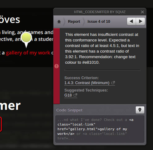
At first glance, this red on black text does not look like it's very low contrast - and to some folks it might be perfectly sufficient! However, if you look at this screenshot in greyscale, you can see the problem:
For users who have color-blindness, this pair of colors is very hard to discern, making this text really hard to read! This is because although the colors are fairly different by hue they are not far apart in brightness.
Luckily, this issue was very easy to fix. HTML_CodeSniffer suggested a new red color that was a bit brighter, and switching my links over to that resolved this failure and made those links a lot easier to read for everyone.
Social Media Links Not Having Content
Another accessibility issue HTML_CodeSniffer found is the social media links in my footer not having content, which I notated in GitHub issue #6 on my personal site's repository. Here's a screenshot of that failure from HTML_CodeSniffer:
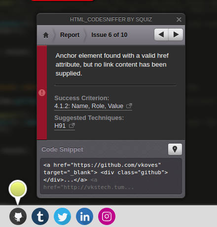
Reading through the text of the error, this might seem a little confusing. What does it mean by saying the anchor element has “no link content”? It's an image!
In this case, what this was actually indicating was that I had used a <div> with a background image for my social media icons, and that was causing a very big accessibility problem. This is because although <img> tags have an alt attribute that you can use to specify text that a screen reader user will hear to represent the image, you can’t do that with a <div> element!
This meant that on my personal site, if a screen reader user tabbed down to the footer, they would hear… nothing. After all, there was nothing in the link to explain what it was!
There are two ways I could have fixed this issue:
- Switch to an
<img>element and use analttag to describe the image - Use an alternate way of labelling the links, like an
aria-label
Although the first solution is preferable and makes your HTML more semantic, I
was using SVGs for my social media icons and was planning to move them into a spritesheet, which would have been very difficult to do with an <img> element. Since I knew I needed to use a background image, I ended up taking the latter approach.
Here's what the faulty code was before:
<a href="https://www.linkedin.com/in/viktorkoves">
    <div class="linkedin"></div>
</a>
And here is the corrected, accessible version:
<a href="https://www.linkedin.com/in/viktorkoves"
  aria-label="Viktor on LinkedIn">
    <div class="linkedin"></div>
</a>
The difference here is only the aria-label on the <a> tag, which now provides content for screen reader users - ensuring that when they navigate to my footer, they get a proper idea of where this link goes.
What I Missed
Despite my best efforts, using automated tools and a screen reader as a sighted user is only a best guess at what users might really need.
I was very appreciative when someone reached out to me on LinkedIn and told me that they had a hard time navigating my portfolio page because I hadn’t used headers to break apart the page. This is something I had completely missed in my testing! I was looking so much at automated auditing tools and full-on accessibility “failures” that I missed a huge piece of usability improvement. In this moment, I should have taken the advice that I gave in a previous article:
Remember that automated auditing tools are a starting point to learning about whether a site is accessible, but they aren’t fool-proof. There are lots of things that are really important to accessibility like tab order and keyboard interactivity that an automated tool is going to have a very hard time testing, if it can test it at all.
I think it is important to remember that no matter how hard we might try to accommodate everyone's accessibility needs, we are just making our best guesses and we are likely to miss something. This is why frameworks like inclusive design are so critical - our users are ultimately the true determination of whether we really made a fully accessible site.
Is there an accessibility related topic you want to learn more about? Tweet at me!