The Accessible Developer's Starter Kit
Published February 09, 2020
Whether you are just starting out learning about web accessibility or you are an experienced developer well aware of accessibility, I want to help. This post will show you some of the tools that I have been using for the past few years to find and fix accessibility issues.
Auditing Tools


Remember that automated auditing tools are a starting point to learning about whether a site is accessible, but they aren't fool-proof. There are lots of things that are really important to accessibility like tab order and keyboard interactivity that an automated tool is going to have a very hard time testing, if it can test it at all.
The only sure fire way to find out if your site is fully accessible is to test it with a wide variety of users with disabilities, hire professional auditors, or both!
HTML_CodeSniffer


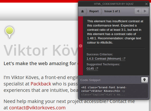
HTML_CodeSniffer is one of my favorite tools for doing a quick accessibility check on a page as it is super fast, can target multiple accessibility standards, and makes it really easy to filter between errors, warnings, and notices. I actually learned about it from an auditor who used it as a starting point for finding more simple failures like contrast that would take a long time to do manually.
Here's a screenshot showing it finding a contrast failure I put on my homepage:

HTML_CodeSniffer is also surprisingly simple to install, since it's a “bookmarklet” that just requires you to make a bookmark with some javascript code. Try it at the HTML_CodeSniffer website!
Chrome DevTools' Lighthouse


If you are interested in website performance, you have probably heard about Lighthouse, an auditing tool built into Google Chrome's DevTools. You might already know that it can audit a website and make recommendations for performance and web best practices, but it's also great as a quick accessibility auditor!
Lighthouse does a number of automated accessibility checks, and also lists out checks you should do manually to properly confirm your sites accessibility. It gives you an overall score on accessibility from 1 to 100, which can help you get a good overall sense of if your site is mostly accessible or really inaccessible, which can be hard to determine with other tools.
Check it out in Google Chrome's DevTools, and learn more about it at the Chrome Lighthouse page.
Accessibility Insights for Web


Accessibility Insights for Web is a Chrome extension built by Microsoft. It helps you look at headings, tab order, and color contrast in more intuitive ways than just a list of failures. You can use a visualizer for tab order (called “Tab Stops”) that will number the tab order as you hit the tab key, making it really obvious if something is out of place. It can also show you all of the headings on your page, which can help you catch bad heading order or tell you if you don’t have enough headings breaking up your content.
Lastly, its color tool lets you make your entire website greyscale, which can help you find not only color-contrast misses but also if you have content that requires color for its meaning - like fields that only indicate they are errored by turning red. I can’t recommend this tool strongly enough.
Install it or learn more at the Accessibility Insights for Web Chrome Web Store page.
Contrast Ratio


Sometimes you just need a tool that tells you if two colors are WCAG contrast compliant, and Contrast Ratio does just that. You input two colors, and it will tell you whether the pairing is WCAG AAA compliant, AA compliant, AA compliant at certain sizes, or not compliant. It's one of my most used tools when I am designing a site!
Try it out at contrast-ratio.com.
Accessibility Tools


When working on web accessibility, you don’t want to just use your tools to tell you if something is accessible or not - you want to try out accessibility tools that your users actually use to see if they are working as you expect!
Using a screen reader or other accessibility tools is going to give you so more information about the experience your actual users have than any tool can provide you, and it can also catch issues that automated tools might miss, especially in more dynamic interfaces.
NVDA and ChromeVox


NVDA and ChromeVox are both screen readers, and I have used both of them to audit pages and to test if our screen reader users were getting the content we were trying to communicate via properties like aria-live.
ChromeVox is my day-to-day screen reader, as it's a Chrome extension that is easy to install and works on Linux (which is pretty rare). However, it's no longer maintained and can handle certain aria tags incorrectly.
NVDA, on the other hand, is a free screen reader for Windows, and it's my screen reader of choice when I want to test on a Windows machine. It's more popular and more maintained than ChromeVox.
Download NVDA or learn more at the NVDA homepage. Install or learn more about ChromeVox at ChromeVox's Chrome Web Store page.
ZoomText


ZoomText is a tool that I actually heard about thanks to a user with low vision, who used it to change the color scheme of websites and to magnify the screen beyond the browser limit of about 500%.
It's really useful for making sure that your website properly handles different color schemes and for finding accessibility issues you might not find otherwise, like your links relying on color differences that are lost with a custom color scheme.
Download it or learn more at ZoomText's homepage.
Have suggestions for a tool that you love that I should try out? Tweet at me!