User Testing for Better Websites - A Case Study with Decarb My State
Published June 07, 2023
If you’ve worked in software development or design for a while, you have very likely heard about the value of user testing, but you may not have had the opportunity to take advantage of user testing much in your work yet. I want to show you some user testing we did for DecarbMyState.com, and how it helped make sure our climate site was both easy to use but also left our users with the positive emotional impact we were striving for.
Why We Ran User Testing
Let’s start with some background: at Chi Hack Night back in December 2022 we had been working on a climate site for several months and wanted to make sure that it achieved all of our goals. For us these were:
- Have the site be functional and easy to use
- Help users understand their state’s emissions and sources
- Making users feel optimistic about climate solutions
By the time we were considering user testing we had a very functional site with a lot of useful information and a pretty polished UI, so we were hoping user testing would validate those opinions and show we were meeting our goals. Instead, our user testing surprised us by revealing some huge gaps in our site.
Our User Test Setup
To create our user testing setup, we wanted to simulate how we felt most people would approach our site, which was starting from the homepage without any specific context or background information on our site. This was meant to match the experience if someone, say, saw a sticker with our URL on it and chose to visit the site.
To try and imitate this type of interaction, we gave users some basic instructions describing our user interview, including asking them to think out loud and letting them know we wouldn’t answer any questions, but offered no information about our site or any specific tasks. We also specifically made sure to recruit folks who were coming to their first Chi Hack Night, and thus had never heard about our project before. By telling our testers very little about the site and setting no specific goals for them (since Decarb My State is an informational site) we hoped to get a better understanding of how easy our site was to use, what users were taking away from the site, and how the site made them feel.
The Actual Tests
We ran four user tests with our first version of the site, and we learned a lot right away. First and foremost, we learned that a shocking 50% (two of four) of testers never got to our largest page - the state details page. To provide more context, Decarb My State has a homepage with a map that links to our largest pages, which provide details on every single state, including breakdowns of where their emissions come from by category and very specific solutions to each category of emissions. In the header we have our Take Action page (which we link at the end of each state’s details page) and some supplemental pages like our About page and FAQ, but that one half of users essentially only experienced the least important pages on our website.
Improving Navigation Clarity
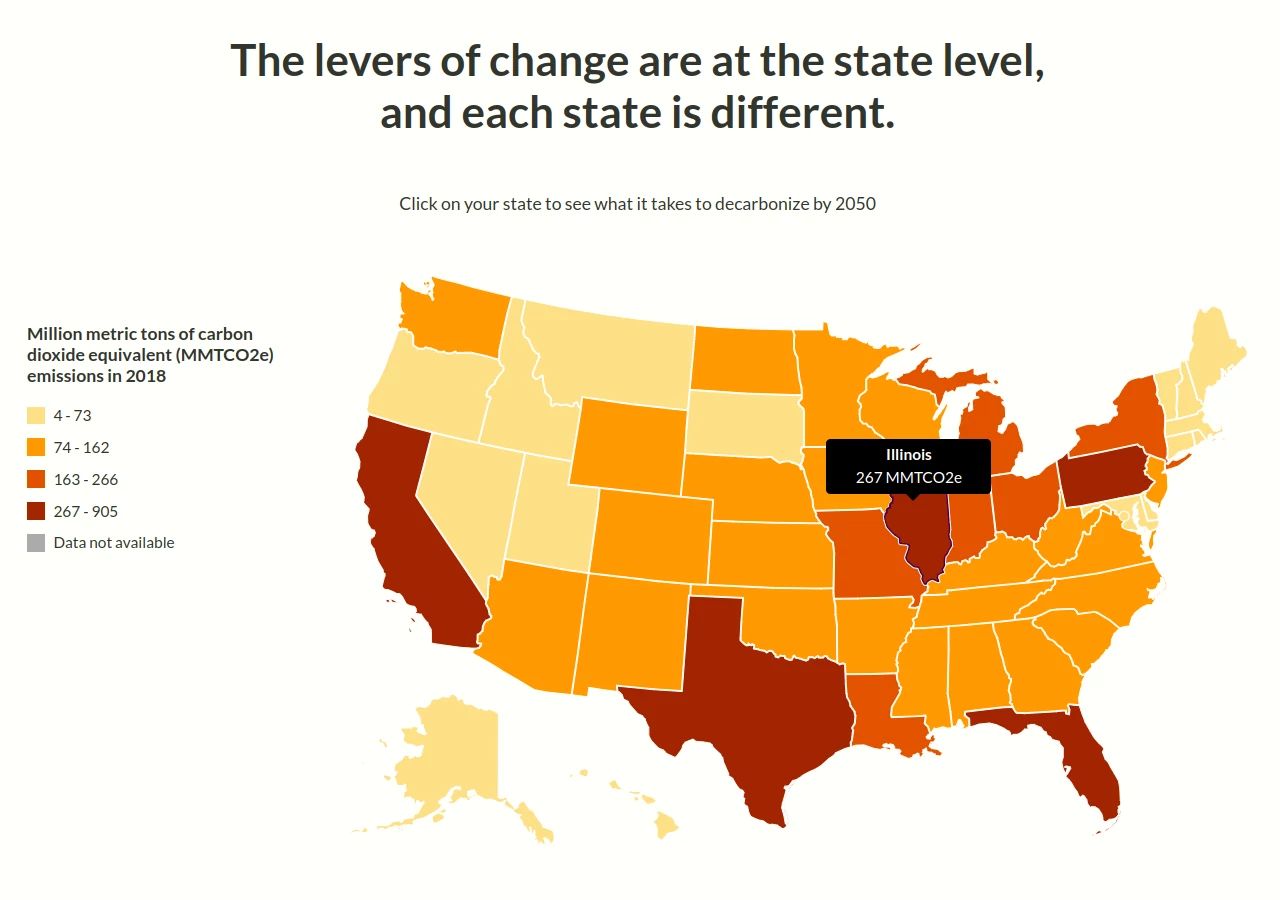
This was a huge miss, but it turns out there was a very simple explanation. Here’s what the Decarb My State homepage looked like if you hovered over the state of Illinois on the map:

The users in our tests were hovering over a state they were interested in, and then saw some emissions statistics. This gave them a misconception about our site, that the map UI was a data visualization, and not a navigation tool. Users see maps with data tooltips all the time across the web, and with no other prompting, they thought hovering was the only available interaction.
We made the decision that a simple wording change to add an action verb to the tooltip would help users understand the map navigation UI. Here’s what it looked like after our change:
![Decarb My State homepage showing a map of the US with different states in different colors, with a tooltip over Illinois that says "Illinois 267 MMTCO2e [newline] View Details [underlined]](/post-assets/user-stories-decarb/map-tooltip-after.webp)
There are a few different changes here that we stacked to make sure users understood the map was more interactive, since this was their entry point to our core state pages:
- We updated the heading above to say “Choose your state”, making it clear (if users read it) the map was actually a call to action (with “choose” implying clicking)
- We added the phrase “View Details” below the tooltip
- We underlined the “View Details” text to add to the feeling that the user was interfacing with a link. Although this text itself isn’t technically a link, the tooltip ignores pointer events, so clicking it will click through to the hovered state below it.
We ran some user tests after this change and found, as hoped, users immediately understood the homepage map was a navigation tool and navigated to the state details page that we had invested most of our time in.
Encouraging Optimism With Our Wording
Our second big opportunity for improvement came from some of the questions we asked to close out our user interviews. For our site, we asked the following questions after each session was done:
- What takeaways do you have from this site?
- How did this website make you feel?
- On a scale of 1 to 10, how likely are you to take any of the actions you saw on the website? Why?
- What would you need to increase this number?
We saw positive results on most of the points, but saw a wide disparity on point #2. Although some of our users felt optimistic (often including those who never saw the state details pages and only saw the Take Action page), many actually said they felt more pessimistic worried after seeing the state details page than they had before. There were a few factors playing into this, including seeing low progress on some of our state specific sector charts (like % of cars on the road that are electric), but there was one big one - the last section of the state details page.
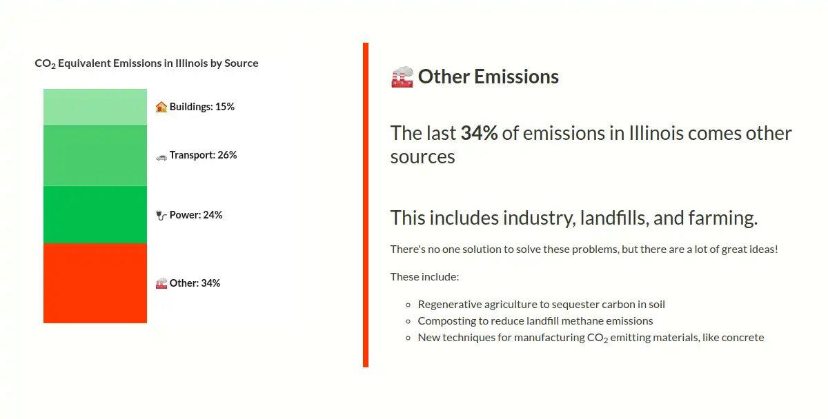
For Decarb My State, we break down emissions into four sections: buildings, transport, power, and other. Decarb My State is a very narrowly focused site that in particular is pitching the merits of clean electrification (moving fossil fuel uses to electricity, then creating clean electricity via renewables) but this means that although we have a lot to say in the first three sections, the last section is not really related to the main pitch of our site. To that end, here’s what our “Other” section used to look like before:

This text was fine from a factual perspective, since it correctly communicates what the other category includes and a few potential solutions, but it completely fails from an emotional perspective, which is crucial especially for the second to last section on a page. Our intent was to communicate to our users that we were aware that the “Other” section was a significant proportion of emissions and provide some ideas while avoiding having to go into too much detail. However, our test users actually saw our lack of more action items as a sign this section was just not fixable because we didn’t have as much to say on it, and we didn’t explain why.
To that end, we spent a lot of time thinking through how we could tweak this section, to make sure our users would understand both that there were solutions but also why we wouldn’t go into more detail about this set of emissions. To this end, we ended up changing this section like so:
![Page showing "Other Emissions" heading with text underneath that says "The last 34% of emissions in Illinois come form other sources. This includes farming, landfills, industry, and leaks from gas pipelines. There's no [one italicized] solution to solve these problems, but there are lots of great ideas:" There is then a list of five ideas with emoji, followed by the text "That doesn't mean there's no solution, it just means that clean electrification doesn't help with these problems, and you could fill a whole book with covering all of them. We need to encourage our politicians to invest in researching new solutions and implementing existing solutions to these problems!](/post-assets/user-stories-decarb/other-after.webp)
Similar to last time, there’s a confluence of changes here to make sure we fully address the problem we saw in user testing. In particular:
- We added more solutions to give people more of a sense of the existing ideas to address these emissions
- We added a note at the end of this section explaining why we weren’t going into as much detail on this section, which was because it isn’t related to clean electrification and requires a variety of smaller solutions rather than large but easy to explain infrastructure swaps
- We increased emphasis on the solutions by adding emojis and increasing font size, so we were certain users saw the proposals and not just a short section listing the emissions sources.
In our following rounds of user testing we consistently found users coming away from our site more optimistic, matching our goals and indicating the changes to the “Other” section had the intended effect.
Closing Thoughts
We made lots of other tweaks to Decarb My State, including a next year goal for progress graphs, clearer graph labels, and splitting apart our Take Action page into clear Renter and Homeowner sections, but these two changes were the most major, and they reflected knowledge we gained directly from user testing and we would very likely never have gotten otherwise. Like a lot of user testing, it was extremely difficult to watch users struggle to use our site or have it make them feel pessimistic, but that challenge really inspired and motivated us to make our site better, and in hindsight the new changes absolutely seem like no-brainers. Decarb My State is incalculably better for the changes that we made as a result of this user testing.
To close, I want to first give a thank you to one of the largest voices in this space, Steve Krug. His books, including “Don’t Make Me Think”, were fundamental in showing me the value of user testing as well as how to run a good user test, and they contain timeless wisdom that is independent of tech stack or really applies to any application or product, whether on the web or not.
I also want to give a huge thank you both to all of the hard-working folks who have contributed to Decarb My State (including making these changes) and those who volunteered to test our site. Decarb My State is a project coming out of the excellent Chi Hack Night, a local group that has created many instrumental sites to solve Chicago’s biggest problems.